Does diversification work? Analyzing the Sharpe ratio of my portfolio
· 1863 words · 9 minutes read
In a previous post, I analyzed the historical performance of my portfolio of index funds. I calculated that, on average, it achieved a 6.8% annual return rate for the period between 2000 and 2015. When you look only at the returns of a portfolio, however, you’re not seeing the entire picture of its performance. A high return could be the consequence of taking excessive risks rather than investing wisely, something that could be illustrated by cryptocurrencies, for example.
The Sharpe ratio of an investment is a way to examine the performance while taking into account risk. In this post, I analyze the Sharpe ratio of my portfolio so that we can gain a more complete understanding of its performance. By comparing it with benchmarks such as the S&P 500 and the MSCI World index, we can see whether our diversification strategy is beneficial.
What is the Sharpe ratio?
The Sharpe ratio is a means for measuring the performance of a portfolio that incorporates the notion of risk. In essence, the Sharpe ratio of an investment is its return divided by the risk taken to achieve that return.
$$ S = \frac{return}{risk} $$
This formula tells us that we need to find a way to quantify both the return and the risk of a portfolio. It’s easy to calculate the average return, but how we can translate risk, which is an abstract notion, into a single number?
The Sharpe ratio finds its origins in the capital asset pricing model (CAPM). This model posits that the risk of an investment equals its volatility and considers investments that have big fluctuations, such as cryptocurrencies, to be risky.
From statistics, we know that we can use the standard deviation to compute the volatility of an investment. We now come to the formula for the Sharpe ratio:
$$ S = \frac{E[R - R_f]}{\sigma(R - R_f)} $$
Don’t be scared! Let’s go through the equation bit by bit.
$R$ is the return of our portfolio and $R_f$ is the risk-free rate. A risk-free investment is one where it’s impossible to suffer losses. For example, a savings account is a risk-free investment, because the interest rate that the bank pays out will never be negative. However, your bank can still go bankrupt so it’s not as risk-free as we think. Therefore, we use the returns on short-dated government bonds in the calculation of the Sharpe ratio. In particular, we use the Effective Federal Funds Rate set by the US government, which is the interest rate used by banks when they lend each other money.
Knowing this, we can interpret $R - R_f$ as the return of our portfolio adjusted for the risk-free rate. We call this the excess return: it’s the return that we make on top of the return that we get when no risk is taken.
$E[X]$ is the mathematical notation to denote the average. In our case, $E[R - R_f]$ is the average excess return of our portfolio.
Finally, $\sigma$ is the mathematical notation for the standard deviation. As we mentioned before, we use the standard deviation as a way to measure the risk of our portfolio. $\sigma(R - R_f)$ is the standard deviation of our excess return.
There we have it! Now let’s see how we can interpret the Sharpe ratio.
What does the Sharpe ratio tell us?
A high Sharpe ratio means that we achieve a high return without taking much risk. Alternatively, we can say that our high returns are the result of smart investment decisions rather than excessive risk-taking. Therefore a higher Sharpe ratio is better.
We can increase the Sharpe ratio of our investments by either obtaining higher returns or reducing the volatility.
Sharpe ratio analysis on our portfolio
The portfolio
The table below shows my portfolio, which is the one that I’ll be analyzing.
| Type | ETF | Allocation |
|---|---|---|
| Government bonds | Xtrackers Global Sovereign | 18% |
| Developed markets | iShares Core MSCI World | 49% |
| Small cap | iShares MSCI World Small Cap | 14% |
| Emerging markets | Xtrackers MSCI Emerging Markets | 10% |
| REIT | Amundi ETF FTSE EPRA NAREIT Global | 9% |
The simulator
During my research, I looked for existing software that I could use to run this analysis, but I couldn’t find one that suited my needs. So I used my software engineering skills to build my own. All the numbers and charts that follow come from the simulation on Backtest.
The results
The Sharpe ratio of the portfolio is 0.34 for the period from 2000 to 2015. What does this mean? This doesn’t tell us very much on its own, so we’ll need to compare it against benchmarks.
The standard benchmark to use is the S&P 500 index. However, I also wanted to compare the portfolio to the MSCI World index, because almost half of the portfolio consists of this index. The comparison will teach us whether the presence of the other funds in the portfolio benefits its performance.
The results are in the table below.
| Name | Average annual return | Standard deviation | Sharpe ratio |
|---|---|---|---|
| Yoran’s Portfolio | 7.2% | 20.3 | 0.34 |
| S&P 500 | 5.4% | 18.6 | 0.29 |
| MSCI World | 5.4% | 23.0 | 0.24 |
The Sharpe ratio of my portfolio beats that of both the S&P 500 and the MSCI World index, which shows that our diversification works! The volatility is higher than that of the S&P 500, but the greater return compensates for it. Furthermore, our diversified portfolio performs better than the MSCI World index on its own, both in terms of returns and volatility.
Evolution of the Sharpe ratio over time
I then wanted to see how the Sharpe ratio evolved over time. In the graph below, I plotted the Sharpe ratios within each year. It turns out that it varies a lot from year to year!
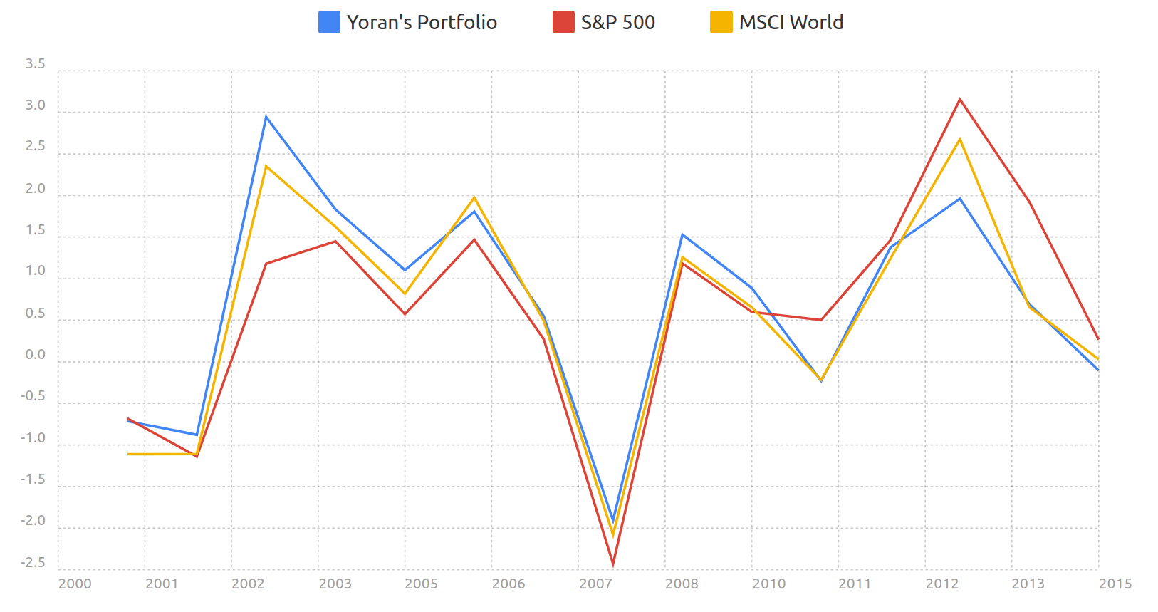
Evolution of the Sharpe ratio year to year.
It seems to follow the trend of the markets as a whole, which makes sense since the Sharpe ratio is based on the annual returns after all. For instance, during the financial crisis of 2007-2008, the Sharpe ratio was negative because the markets were down by almost 50%.
For the past few years, both the S&P 500 and the MSCI World index have had a better Sharpe ratio than my portfolio. This could be attributed to the other funds in the portfolio, i.e. emerging markets, small cap, real-estate and bonds, which haven’t been performing as well as stocks in the developed markets. Still, as we’ve seen in the previous analysis, our portfolio maintains a better overall performance over a longer period of time.
The Sharpe ratios of top funds
Finally, let’s conclude by looking at the Sharpe ratios of some of the best actively managed funds.
We’ll start with Berkshire Hathaway, Warren Buffett’s “fund”. Because it’s a publicly traded company, the historical data is available on Yahoo Finance. From 2000 to 2015, its Sharpe ratio was 0.46 for an annual average return of 8.5% and a standard deviation of 18.5. This is better than the Sharpe ratio of my portfolio, which was only 0.34. But that’s to be expected, considering Warren Buffett is one of the most successful investors in recent decades.
Let’s look at another legendary fund: the Medallion Fund. It’s managed by Renaissance Technologies, the hedge fund founded by the mathematician James Simons. Unlike Berkshire Hathaway, hedge funds are not required to publicly disclose their returns, making it so I couldn’t run my own analysis. That said, I found a Quora answer that sheds some light on the Sharpe ratio they are achieving. It’s very impressive, to say the least:
The Medallion fund, around since 1988, had a Sharpe ratio around 2 for a while, then after the mid-90s, they made a number of improvements (and rolled an equities strategy into the fund that was previously only futures / currencies), bringing the Sharpe up to 4 or so. Beyond 2000, they made further improvements that brought up the Sharpe ratio to levels of 10 or higher[…]
Both Berkshire Hathaway and Renaissance Technologies are amongst the top actively managed funds, so it’s not a surprise that they achieve higher Sharpe ratios than our portfolio based on index funds. However, the majority of actively managed funds are outperformed by the S&P 500. Because the top funds are not accessible to the common man, passive investing is the best strategy that we can follow.
Limitations of the analysis
As with any analysis, there are limitations to its validity. The Sharpe ratio has several weaknesses, and extending the time period of our analysis would strengthen our conclusions.
Longer-time horizon
I calculated the Sharpe ratio for the period from 2000 to 2015 because it’s the only data that I have available. Ideally, I’d like to extend the duration of the simulation, so I’m on the lookout for sources where I can find additional historical data that extends outside of this time period for the funds within my portfolio.
Weaknesses of the Sharpe ratio
The Sharpe ratio comes from the capital asset pricing model, which, like any other scientific model, is only an approximation and not a precise representation of the real world. Some of the assumptions underlying the Sharpe ratio may not be entirely accurate.
Returns of real investments are not normally distributed
In order to use the standard deviation to calculate the volatility of an investment, the returns of the investment must be distributed according to the normal distribution. However, in reality, this is not the case. Instead, the returns of investments in financial markets have fatter tails, meaning that outliers happen more frequently than the normal distribution would dictate.
This means that the standard deviation is not an entirely accurate way to calculate the volatility of our portfolio and that the “real” Sharpe ratio, calculated for its actual distribution, would be different.
The Sharpe ratio punishes upside volatility
The Sharpe ratio treats all volatility the same. However, you can argue that upside volatility is not as bad as downside volatility. In fact, upside volatility is required to achieve high returns.
For instance, if your returns over a 4-year period are 0% 20% 0% 20%, the Sharpe ratio will be very low because of the high volatility. Yet you’ve never had a drawdown and your risk is managed correctly.
Negative Sharpe ratios have no meaning
We saw in the chart above that Sharpe ratios become negative during recessions. In those situations, the formula says that we can bring the Sharpe ratio closer to zero by increasing volatility. Simple logic tells us that this is not a good thing to do, so the Sharpe ratio is a bad tool for analysis during periods of negative returns.
Conclusion
After having solely analyzed the returns of my portfolio, this post is an important step in gaining a deeper understanding of its performance by introducing the notion of risk into our analysis. Despite its limitations, the Sharpe ratio is a useful tool with which we can compare the risk-adjusted performance of a portfolio to benchmarks such as the S&P 500 or the MSCI World index.
By showing that the Sharpe ratio of our portfolio is higher than that of the MSCI World index, we can conclude that the diversification in our portfolio works. This gives me confidence in its future performance.